The International Telecommunication Union has issued their yearly report on the measurement of the Information Society, e-Readiness and/or the Digital Divide: Measuring the Information Society 2010.
The report provides new and up-to-date calculations of the ICT Development Index, which are then used to back the statement that The digital divide is shrinking slightly
. The problem is that, in my opinion, the digital divide is widening. How is it so?
Four years ago I already had this same sort of reflection then concerning the World Telecommunication/ICT Development Report 2006. The ITU’s calculations were then technically right, and nevertheless my disagreement was twofold. On the one hand, I thought that not only euclidean distances but the absolute values themselves of telephone penetration should also to be taken into account; on the other hand, the ITU just did not took into account broadband to define the digital divide, an (in my opinion) unforgivable omission.
This year the problem comes over again. The report repeatedly states that the digital divide is shrinking. To be able to do so, the ITU creates four groups (high, upper, middle, low) in which economies are aggregated; averages are calculated et, voilà, the digital divide is shrinking. But we know the problem with averages: (1) I’ve got two apples, you’ve got none, on average we’ve got one each; (2) my left foot stands in frozen water, my right one in boiling water and, on average, I’m pretty comfortable, thank you very much.
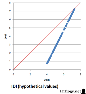
Let us look instead at what has happened at the disaggregate level. And to do so, let us build a hypothetical model where, in the last year (from 2007 to 2008) every economy would have reduced by a half the distance they had in the previous year with the leader. That is:
IDIey = IDIey-1 + 1/2(IDIly-1 – IDIey-1)
Where e is a specific economy, l is the leading economy (the economy with a highest IDI value), and y is the year. If we plotted the IDI values for year 2007 against these hypothetical values for year 2008, the result is:

Source: ITU (2010). Measuring the Information Society 2010
for year 2007 values (year 2008 are made up).
If all blue dots stayed just on the red line, nothing would have happened. As the lesser digitally developed countries are far from it — while the higher digitally developed ones are closer to it — it means that their IDI values for this year are higher than in the previous one, and they are higher the more distant they initially were in relationship with the leader, whose IDI value has remained constant. This is what a shrinking digital divide would look like.
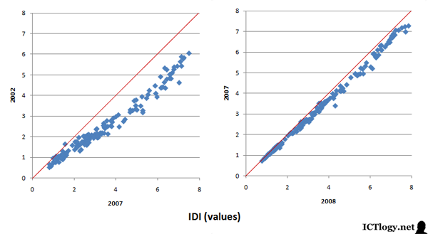
Let us look now at what has happened between 2002 and 2007 and 2007 and 2008, which is how data is provided in the two last Measuring the Information Society reports:
As can be easily seen, the evolution of the IDI during the 2002-2008 is just the opposite to what we should be expecting was the digital divide really shrinking. Instead, we see that the economies with higher IDI values (i.e. more digitally developed) increased their IDI values during that period much more than the countries with lower values. Yes, all economies achieved higher degrees of digital development as measured by the ICT Development Index, but the richer, the more development achieved, not the other way round, thus increasing the digital divide, not shrinking it.
My calculations could be wrong and my approach could be plain wrong, but aggregates usually are worst approaches than disaggregates. Besides, people wants to hear bad news (the digital divide is shrinking
) rather than listening to wet blankets. The problem is that if we do believe the divide is shrinking then we can shift our attention and resources elsewhere, thus worsening a situation that was even worse than admitted.
Update 20100301
Giacomo Zanello suggests in the comments to analyze whether the distance of a specific country with the leader has either increased or decreased. That is, to calculate this (I slightly modify his proposal to adjust it to the nomenclature already used and to produce mostly positive values):
Δ IDI_distance_to_leaderey = |IDIly – IDIey| – |IDIly-1 – IDIey-1|
The results are even more clear than the ones I had already used. By using Zanello’s exercise, we do see that the distance to the leader in tems of IDI values increases the less digitally developed countries are. In other words: lesser digitally developed countries are increasingly far from higher digitally developed countries, hence the digital divide is increasing, and it increases more the worst you are.
Thank you so much for the tip, Giacomo!
More Information
- International Telecommunication Union (2010). Measuring the Information Society 2010. Geneva: ITU.
- International Telecommunication Union (2009). Measuring the Information Society – The ICT Development Index 2009.
- World Telecommunication/ICT Development Report 2006: digital divide narrowing?, another article in this blog
- A collection of works by the International Telecommunication Union related with e-Readiness and ICT4D


 , 1.54 MB)